
Honing your greenhouse gas intuition
To have a minimally well thought out climate debate, you need some sense of where the problem is. No, it's not about Taylor Swift's damn plane.

Ask the average person about the reasons why greenhouse gas (GHG) emissions keep rising year after year, and I suspect you’ll get an earful about oil companies, private jets and the perfidy of Western politicians. That being the state of the debate, it’s really just impossible to discuss the issue seriously.
We don’t know —because we haven’t been told— the basic facts about why emissions keep rising. Our intuitions about it are hilariously wrong. And so the public conversation we have about this most important issue ends all weird and misshapen.
Time to hone our intuition.
How? I, personally, found it helpful to go through the EU’s big emissions database (which you can just download here and mess with, if that’s your cup of tea) to get a sense of where emissions are rising, where they’re falling, and where they’re stable.
Let’s start with some rich countries. Take everyone’s favorite punching bag, the good ole U.S.A. How have gringo emissions been doing since 1970?

OK, the U.S. is a big emitter. No way around it. But it’s not a growing emitter.
Emissions are doen a bit this century, it looks like, from 7.2 billion metric tons of CO2 equivalent to just over 6. Not fantastic, but, you know, progress.
Most developed countries are doing better. Here’s Sweden on a clear downward trajectory:

Actually, you see roughly the same pattern around Europe. Emissions peaked some time in the 70s and have been trending down since. Take Belgium…

…or the Brits…

The Italians peaked a little later, but since 2007 the trend is clear:

France, with its big nuclear capacity, has been trending down for most of my lifetime.

Even Germany, who we love to beat up on.

It’s actually hard to find a developed country where emissions are still rising.
I found only a couple, and I’m embarrassed to say my own adopted country, Canada, is one of them:

And Australia is another:
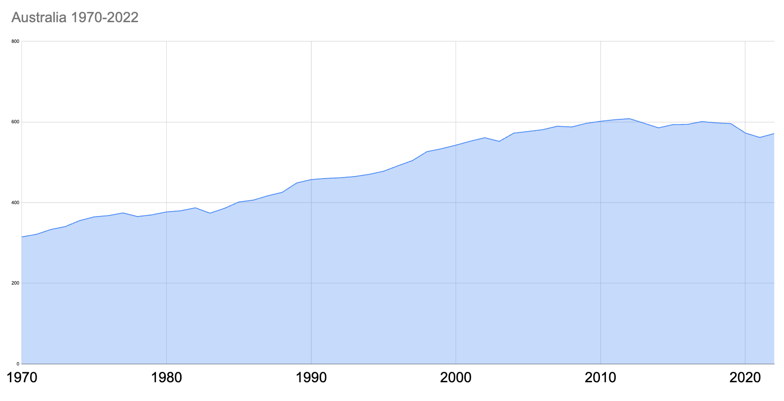
Even in those cases, emissions aren’t rising fast.
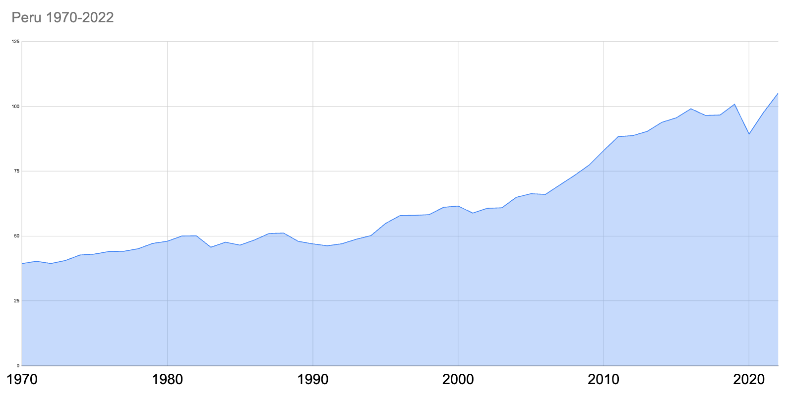
To find the places where emissions are rising fast, you gotta go South.
Because as you look through this data you find that if there’s one thing as hard as finding a rich country where emissions are growing, it’s way harder to find a poor or middle income country where emissions are even stable, let alone falling.
The specifics vary from country to country, sure, but the basic story doesn’t.
Have a look at the Philippines, for instance:

…and at Peru…
Or look at Bangladesh, a development superstar of the 21st century. (Of course, that comes with its own GHG emissions bump):

How about Egypt? Sure enough, even if your government is useless, a fast rising population will do this to your GHG emissions.

or at Indonesia:

You can multiply these examples almost infinitely, but you find a broadly similar pattern everywhere.
Which figures.
In 1970, these were poor countries where the average person had access to shockingly little energy. As they’ve developed, people have been able to afford to consume more energy, and by and large that energy has come from fossil fuels.
Which is why the basic picture of GHG emissions is one you can sum up in one chart. Rich world emissions are falling slow, developing world emissions are rising fast.

If this basic reality was more amply recognized, we might better grasp the broad contours of the climate crisis. Rich country emissions have been falling for a generation. It hasn’t mattered even a little bit because all around the developed world, poor people have been getting less poor, and the process of going from poor to rich, in the world we have today, means rising emissions.
This is the strategic reality at the global level.
Wouldn’t we do well to face it?