

I love a good visualization. Who doesn’t? Like this one, which Our World in Data put out back in 2017:
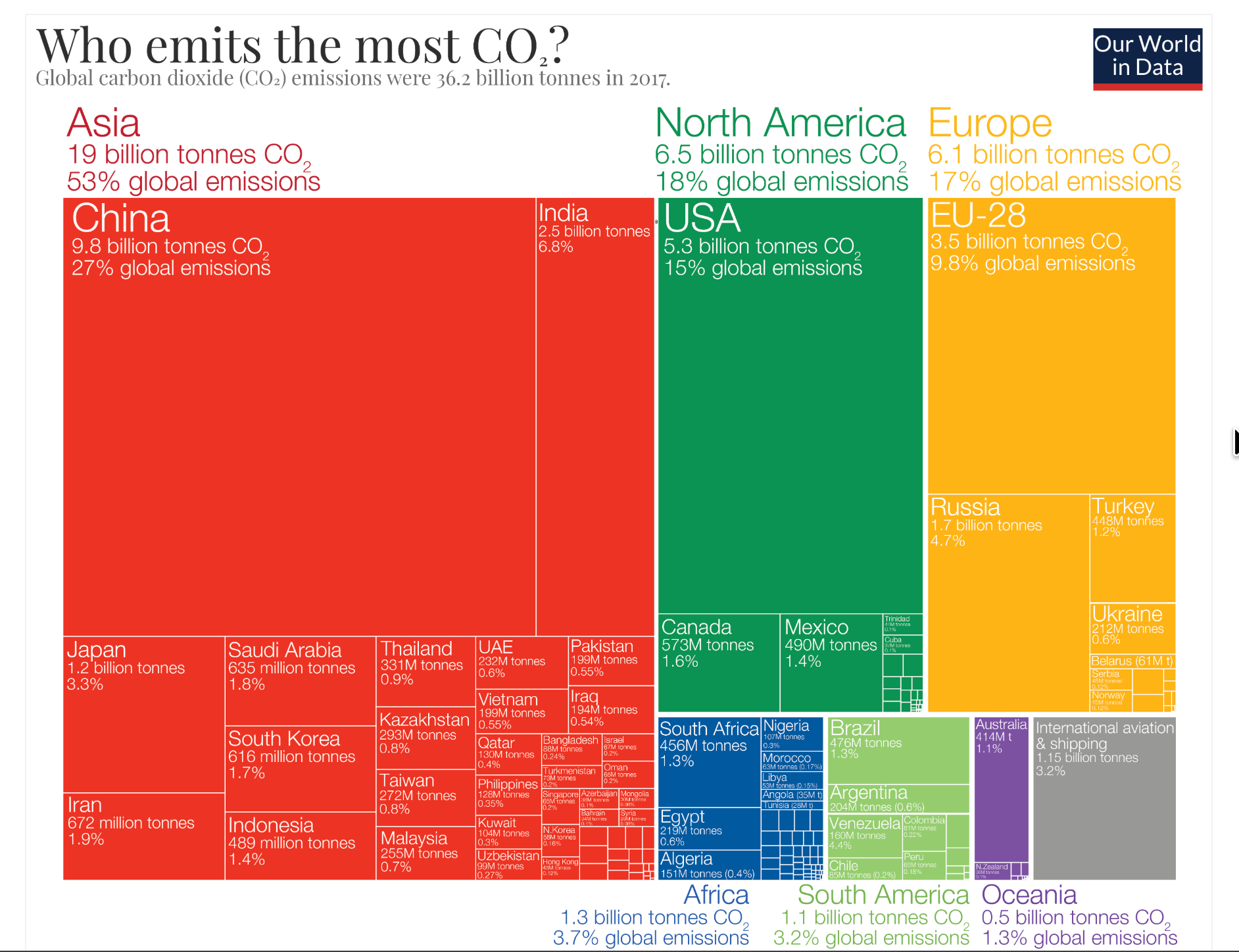
I think that’s illuminating, but I was disappointed to see they haven’t updated the treemap in almost a decade.
Never fear. We live in the future.
I just got Claude to make me an updated version.
Here it is with the latest data (for 2025):
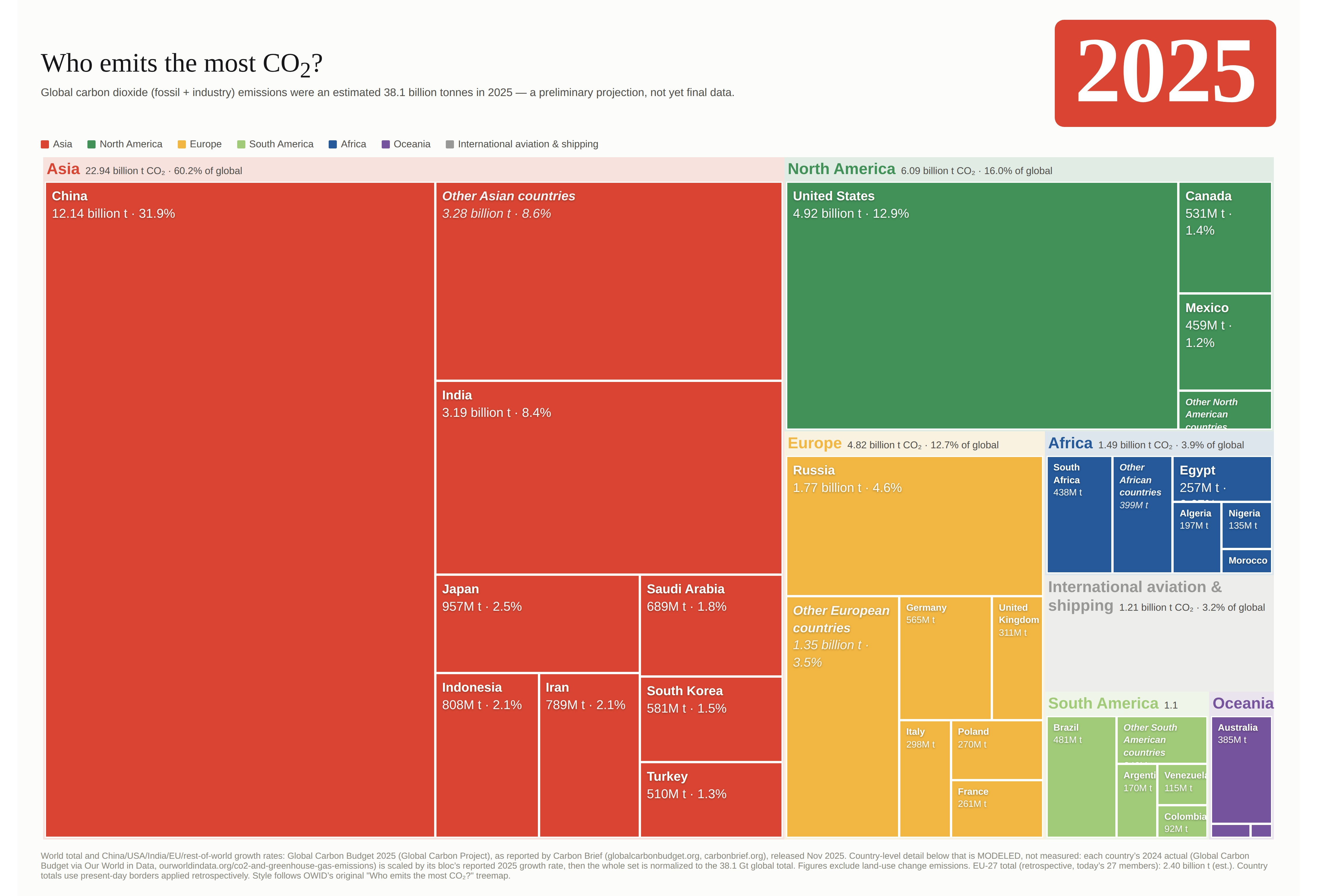
Comparing the two is illuminating.
In a little less than a decade, Asia’s share of CO₂ emissions has grown from 53% of the total to 60%. China’s has grown from 27% to 32%: it now emits more than every rich country put together. India’s share, for its part, has grown from 6.8% to 8.3% of the total.
Meanwhile, emissions keep falling in the developed world — not just in relative terms but also in absolute numbers. The U.S. used to emit 5.3 billion tonnes of CO₂, now it’s down to 4.9 billion.
The EU numbers are a bit harder to compare because of Brexit, but overall the continent’s emissions fell from 6.1 billion tonnes to 4.9, even as Russia’s emissions grew. Even the Aussies and my fellow Canadians, long the mitigation lagards, saw falling emissions over the last 8 years.
The change has been gradual. Every year, emissions from the developing world nudge up a bit, while those from the rich world nudge down a bit. Over time, it compounds.
This kind of change —gradual, undramatic, systemic, in-the-background— has a way of going unnoticed. At no point does it become headline news. Almost by definition, it isn’t news. It’s not an event. It’s a process.
And no one has a good reason to point it out. Rich world climate activists don’t want to draw attention to it, because it makes their monomaniacal fixation with continuing to drive down rich country emissions look pointless (which, erm…) And developing countries don’t want to draw attention to it because they don’t want to take the heat that would come with it.
With no one drawing attention to it, the underlying reality of shifting shares of emissions just never breaks through into the public sphere. Nobody updates their priors. So the debate stays suspended in amber, on a model of reality that’s now two generations out of date.
Ask people to estimate global shares of carbon emissions today, and they’ll usually guess the rich countries account for like 3/4 of global emissions.
Which is a pretty good guess…for 1970!
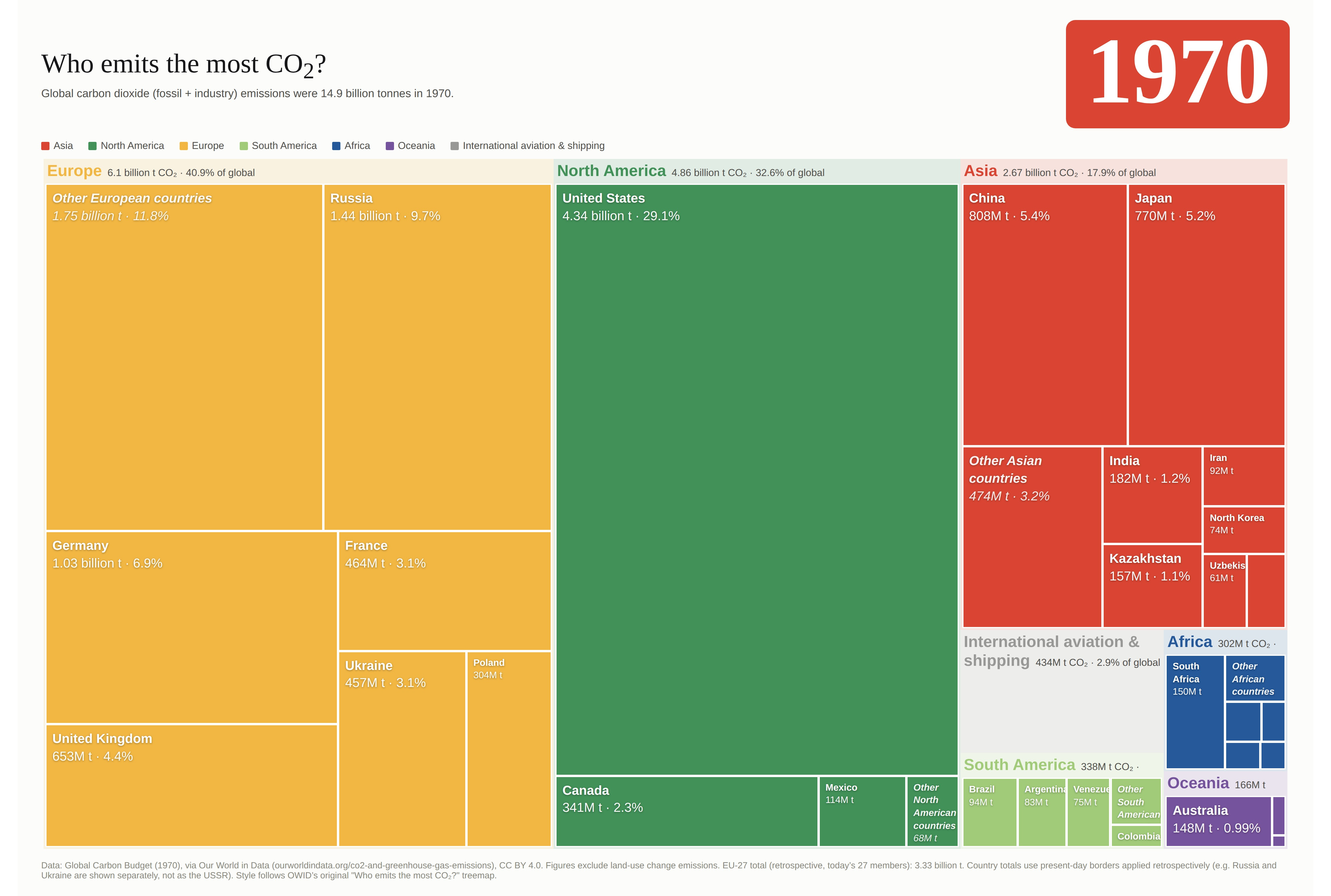
Actually, the climate conversation in the developed world would make a lot more sense if global emissions were like this! If the vast bulk of emissions came from rich countries, an absolutely rigid determination to drive down rich country emissions would count as an incomplete-but-basically-sound approach to the climate crisis.
That’s just not the world we live in now.
China now emits more CO₂ than every rich country put together. China and India together now emit more CO₂ than the whole world emitted in 1970.
We live in a world where rich countries account for a small and shrinking share of emissions, and where pretty much all the growth in emissions comes from middle-income developing countries.
A climate politics that can’t process that fact is just filing for divorce with reality.
Looking at emissions by country makes little sense - you have to look at emissions per person as well.
China and India are populous countries.
I would have guessed that China had fallen much more than this is presenting. Over half of their cars sold last year were electric. The big change is in the freight trucks. they have massive solar farms, hydro electric, as well as nuclear. The still use coal though, and oil for electric generation, so...
I remember the Olympics there, and many of the athletes hesitant to even go because the air pollution was beyond the scope of merely bad. I got the impression that this embarrassed them and this push toward greener solutions came from that moment.
Thanks for this.. it was a good read.